
Smart Crop Selection: Using Machine Learning to Optimize Farming Decisions
In this post, we will work on a project that leverages machine learning to assist farmers in making data-driven decisions about which crop to plant based on essential soil characteristics.

To run the project, we follow the essential steps of a data science project as follows.
1. Problem Definition and Business Understanding
Choosing the right crop to plant each season is a crucial decision for farmers aiming to maximize their yield and profitability. Soil health plays a significant role in crop growth, with factors such as nitrogen, phosphorus, potassium levels, and soil pH having a direct impact on productivity. However, assessing soil conditions can be expensive and time-consuming, leading farmers to prioritize certain metrics based on budget constraints.
The goal is to develop an accurate predictive model that can analyze soil composition and recommend the most suitable crop for optimal yield.
2. Dataset Description
The dataset used for this project, soil_measures.csv, contains key soil metrics collected from various fields. Each row in the dataset represents a set of soil measurements and the corresponding crop that is best suited for those conditions. The features included in the dataset are:
N(Nitrogen): Nitrogen content ratio in the soil, a vital nutrient for plant growth.P(Phosphorous): Phosphorous content ratio, which supports root development and flowering.K(Potassium): Potassium content ratio, essential for disease resistance and water uptake.ph: The acidity or alkalinity level of the soil, impacting nutrient availability.crop: The target variable representing the ideal crop for the given soil composition.
3. Data Exploration and Cleaning
# All required libraries are imported here
import pandas as pd
import numpy as np
from sklearn.model_selection import train_test_split, StratifiedKFold, GridSearchCV
from sklearn.preprocessing import StandardScaler, LabelEncoder
from sklearn.metrics import accuracy_score, classification_report, f1_score
from sklearn.neighbors import KNeighborsClassifier
import xgboost as xgb
import matplotlib.pyplot as plt
import seaborn as sns

# Load dataset
df = pd.read_csv('soil_measures.csv')

# Feature and target selection
X = df[['N', 'P', 'K', 'ph']]
y = df['crop']

# Check for crop types
unique_crop_type = df['crop'].unique()
print(unique_crop_type)
Output:
['rice' 'maize' 'chickpea' 'kidneybeans' 'pigeonpeas' 'mothbeans'
 'mungbean' 'blackgram' 'lentil' 'pomegranate' 'banana' 'mango' 'grapes'
 'watermelon' 'muskmelon' 'apple' 'orange' 'papaya' 'coconut' 'cotton'
 'jute' 'coffee']
# Check for missing values
missing_values_count = df.isna().sum()
print(missing_values_count)
Output:
N       0
P       0
K       0
ph      0
crop    0
dtype: int64
# Visualize feature distributions using box plots
numerical_features = ['N', 'P', 'K', 'ph']

# Box plots
plt.figure(figsize=(12, 6))
for i, feature in enumerate(numerical_features, 1):
    plt.subplot(1, len(numerical_features), i)
    sns.boxplot(y=df[feature])
    plt.title(f'Boxplot of {feature}')
plt.tight_layout()
plt.show()

# Analyze the correlation between features using a heatmap
correlation_matrix = df[numerical_features].corr()

plt.figure(figsize=(8, 6))
sns.heatmap(correlation_matrix, annot=True, fmt='.2f', cmap='coolwarm', square=True)
plt.title('Feature Correlation Heatmap')
plt.show()
Output:
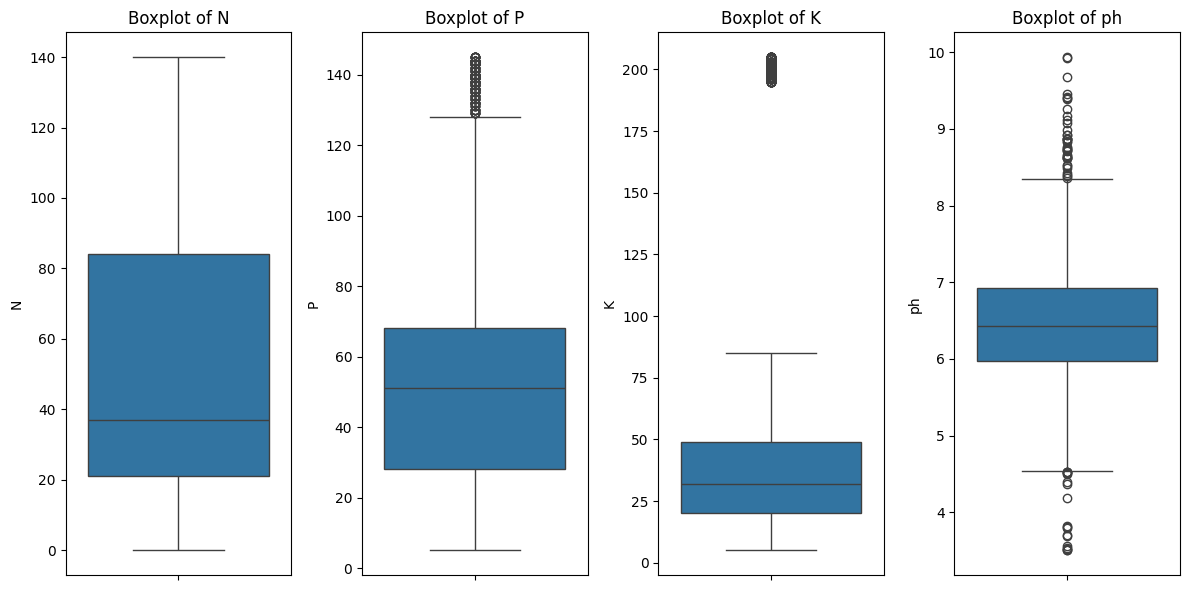
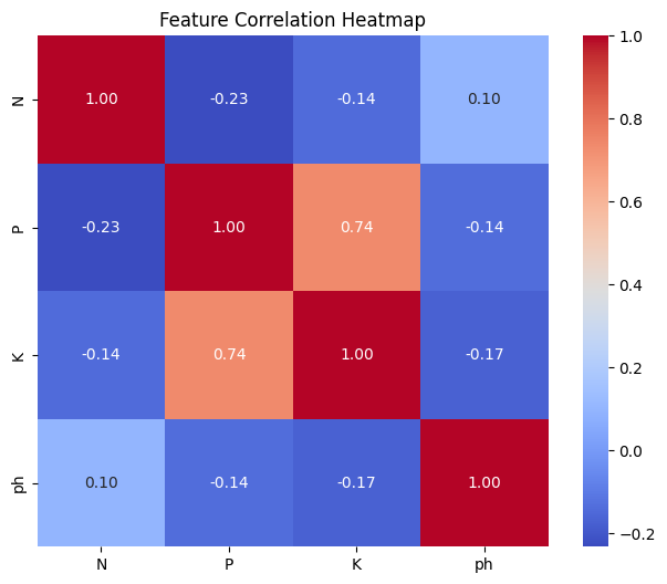
Key Insights:
- The presence of outliers in
PandKsuggests data points with unusually high values, which might require further investigation or potential transformation. - Skewed distributions in
PandKmight indicate the need for data normalization or transformation before modeling. - The strong correlation between
PandKsuggests they might be interdependent, possibly due to similar soil management practices or sources. - Since
phhas weak correlations, it may be treated as an independent factor in subsequent analysis. - Multicollinearity might be an issue in modeling due to the high correlation between
PandK.
Since P and K contain extreme outliers, it is unclear whether the observed strong correlation between them is driven by these outliers or if P and K are genuinely correlated. To investigate this, we conduct an experiment by simultaneously removing the outliers from both P and K, and then re-evaluate their correlation.
# Define numerical features to check for outliers
numerical_features = ['P', 'K']

# Function to remove outliers using IQR
def remove_outliers_iqr(data, columns):
    df_cleaned = data.copy()
    for col in columns:
        Q1 = df_cleaned[col].quantile(0.25)
        Q3 = df_cleaned[col].quantile(0.75)
        IQR = Q3 - Q1
        lower_bound = Q1 - 1.5 * IQR
        upper_bound = Q3 + 1.5 * IQR
        df_cleaned = df_cleaned[(df_cleaned[col] >= lower_bound) & (df_cleaned[col] <= upper_bound)]
    return df_cleaned

# Remove outliers from all numerical features
df_cleaned = remove_outliers_iqr(df, numerical_features)

# Plot boxplots for cleaned data
plt.figure(figsize=(12, 6))
for i, feature in enumerate(numerical_features, 1):
    plt.subplot(1, len(numerical_features), i)
    sns.boxplot(y=df_cleaned[feature], color='green')
    plt.title(f'Boxplot of {feature} (Cleaned)')
plt.tight_layout()
plt.show()

# Analyze the correlation between features using a heatmap
correlation_matrix = df_cleaned[numerical_features].corr()

plt.figure(figsize=(8, 6))
sns.heatmap(correlation_matrix, annot=True, fmt='.2f', cmap='coolwarm', square=True)
plt.title('Feature Correlation Heatmap')
plt.show()

# Check the numberes of crop classes in both orginal and cleaned datasets
original_num_classes = df['crop'].nunique()
cleaned_num_classes = df_cleaned['crop'].nunique()
print(original_num_classes)
print(cleaned_num_classes)
Output:
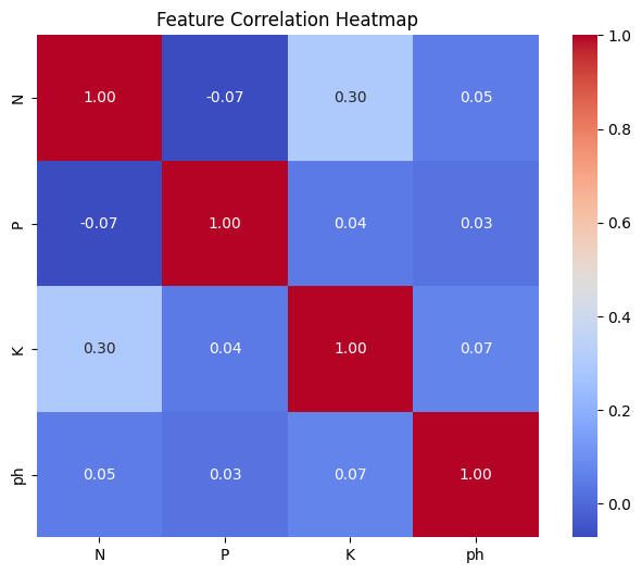
22
20
Key Actionable Insights:
- The correlation between features P and K becomes negligible after outlier removal, indicating that the observed multicollinearity was largely driven by the presence of extreme or anomalous data points. Outliers tend to inflate correlation values, creating a false impression of a strong relationship between variables.
- Removing outliers improves regression model reliability by yielding more accurate coefficients and predictions, reducing the risk of overfitting caused by anomalous data points.
- However, the identified outliers are associated with two specific classes. Eliminating all outliers would result in insufficient data for predicting these two classes.
Given the importance of predicting all classes, the decision is to retain the outliers.
Now, we will investigate the existence of a linear relationship between the features and target variable in the original dataset. This will be achieved by applying one-hot encoding to the categorical target variable and computing the Pearson correlation matrix.
# Perform one-hot encoding on the categorical target variable 'crop'
df_encoded = pd.get_dummies(df, columns=['crop'])

# Calculate Pearson correlation matrix
correlation_matrix = df_encoded.corr(method='pearson')

# Extract correlations between features (N, P, K, ph) and target classes (one-hot encoded crops)
feature_columns = ['N', 'P', 'K', 'ph']
target_columns = [col for col in df_encoded.columns if col.startswith('crop_')]
correlation_with_target = correlation_matrix[feature_columns].loc[target_columns]

# Display the correlation heatmap
plt.figure(figsize=(10, 6))
sns.heatmap(correlation_with_target, annot=True, cmap='coolwarm', fmt='.2f')
plt.title('Pearson Correlation Between Features and Crop Targets')
plt.xlabel('Soil Features')
plt.ylabel('Crop Classes')
plt.show()
Output:
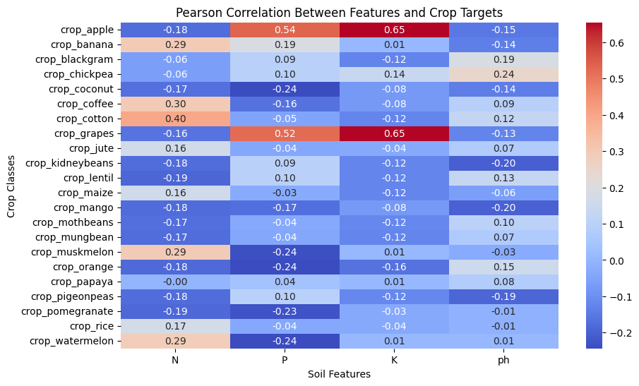
Key insights:
- Most correlations are relatively weak, meaning soil features have only a limited linear influence on crop selection.
- This suggests that linear models such as Logistic Regression may not be suitable, and more advanced models that capture non-linear relationships, such as XGBoost or Random Forest, should be used.
target_counts = df_cleaned['crop'].value_counts()

# Plot the class distribution
plt.figure(figsize=(12, 6))
sns.barplot(x=target_counts.index, y=target_counts.values, palette='viridis')
plt.xticks(rotation=45)
plt.title('Crop Class Distribution')
plt.xlabel('Crop Type')
plt.ylabel('Count')
plt.show()
Output:
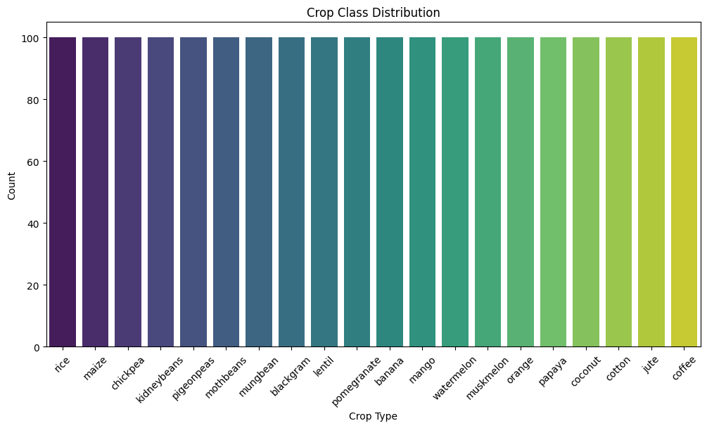
Key insights:
- Since the numbers of data sample of each crop class are the same, the data is balanced.
4. Data Preprocessing
From the insights from the previous step, we will use the original data for data preprocessing steps.
# Feature and target selection
X = df_cleaned[['N', 'P', 'K', 'ph']]
y = df_cleaned['crop']

# Encode the target variable
label_encoder = LabelEncoder()
y_encoded = label_encoder.fit_transform(y)

# Preprocessing: Standardize numerical features
numerical_features = ['N', 'P', 'K', 'ph']
X[numerical_features] = X[numerical_features].astype('float64')
scaler = StandardScaler()
X_scaled = X.copy()
X_scaled[numerical_features] = scaler.fit_transform(X[numerical_features])

# Split the data with stratification
X_train, X_test, y_train, y_test = train_test_split(X_scaled, y_encoded, test_size=0.2, stratify=y_encoded, random_state=42)
5. Model Selection and Training
# Print the number of rows of Cleaned dataset
print(f"Cleaned dataset size: {df_cleaned.shape[0]}")
Output:
Cleaned dataset size: 2000
Recommended models for this small dataset based on the key insights from the EDA step above:
- Since the dataset is small, we will begin by using XGBoost instead of a deep neural network and compare its performance against a baseline model using K-Nearest Neighbors (KNN).
# Define parameter grids for XGBoost and LightGBM
xgb_params = {
    'max_depth': [10, 20],
    'learning_rate': [0.001, 0.1, 1],
    'n_estimators': [100, 200, 500],
    'subsample': [0.7, 0.9]
}

knn_param_grid = {
    'n_neighbors': [3, 5, 7, 9],
    'weights': ['uniform', 'distance'],
    'metric': ['euclidean', 'manhattan']
}

# Perform hyperparameter tuning using cross-validation
kf = StratifiedKFold(n_splits=5, shuffle=True, random_state=42)

# XGBoost tuning
xgb_model = xgb.XGBClassifier(eval_metric='mlogloss',verbosity=1)
xgb_grid = GridSearchCV(estimator=xgb_model, param_grid=xgb_params, cv=kf, scoring='accuracy', n_jobs=1, verbose=1)
xgb_grid.fit(X_train, y_train)

# Hyperparameter tuning for KNN
knn_model = KNeighborsClassifier()
knn_grid_search = GridSearchCV(estimator=knn_model, param_grid=knn_param_grid, cv=kf, scoring='accuracy', n_jobs=1, verbose=1)
knn_grid_search.fit(X_train, y_train)
6. Model Evaluation
Since the data is balanced, accuracy and marco F1-Score (unweighted average F1-Score) are commonly good metrics. However, considering the multi-class nature of the crop classification problem and the potential impact of both false positives and false negatives, we choose macro F1-Score to evaluate the model performance.
# Evaluate models
xgb_best_model = xgb_grid.best_estimator_
xgb_pred = xgb_best_model.predict(X_test)
xgb_f1 = f1_score(y_test, xgb_pred, average='macro')

best_knn_model = knn_grid_search.best_estimator_
knn_pred = best_knn_model.predict(X_test)
knn_f1 = f1_score(y_test, knn_pred, average='macro')

# Plot comparison of macro F1-scores
models = ['XGBoost', 'KNN']
f1_scores = [xgb_f1, knn_f1]

plt.figure(figsize=(8, 5))
plt.bar(models, f1_scores, color=['blue', 'orange'])
plt.xlabel('Model')
plt.ylabel('Macro F1-Score')
plt.title('Comparison of Model Performance')
plt.ylim(0, 1)
plt.show()
Output:
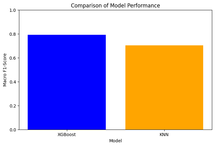
Key Actionable Insights:
- XGBoost outperformed KNN in terms of macro F1-score, making it the preferred model for deployment.
Conclusion
The project has demonstrated that machine learning, particularly tree-based models like XGBoost, can provide valuable insights into agricultural decision-making. With further improvements and expanded datasets, such models can significantly contribute to precision agriculture.
The code of this project is available here.
For further inquiries or collaboration, please contact me at my email.